I interned as an UX Designer at Toppr this past summer where I worked with the Product Team
to create joyful experiences.
Timeline
5 Months, Design Internship and Analysis
My Role
Experience Strategy, Visual Design, Interaction Design, Prototyping
Dileverables
Wireframes, Animated Prototypes, Competitor Analysis Report
Background
More than 3.2 Million people use Toppr daily.
As one of the biggest startups in the edutech domain, it is crucial that experience across all the products is consistent and joyful.
Brief
Designing joyful experiences
for students, teachers and parents
that use Toppr daily.
As part of the internship I worked across the board to improve
the experience of Toppr products, namely-
Toppr Plus Paywall,
Toppr Learning App,
School OS,
Competitive Analysis,
Logo Family
& more.
I also lead the design for
Toppr Ambassador.
A soon to be
launched product part of Toppr Community.
Toppr Plus Paywall
Making the upgrading process more
concise and purposeful
Exploring what works
Presenting the core USPs of the Toppr Plus with the right Information Architecture. The core USPs of the paywall are the following
-Live Classes, Concepts and Videos
-Testimonials
-Upgrade CTA
-Talk to to expert CTA


Context specific cases
These screens are used when a used tries to access any of the premium features within the app as an unpaid user.
Toppr Learning App
Making the practice tool more fun
The practice tool is used by students from classes 6th to 12th, the main challenge is to make the process of learning better and the end goal being that students practice more with Toppr"
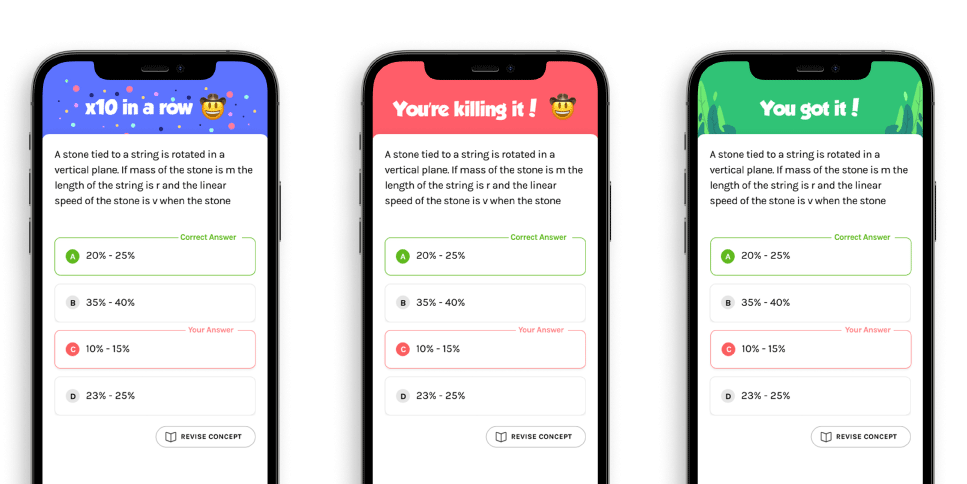
Positive & Negative Nudges
We designed a set of nudges and animations to motivate students to keep practicing.
Success Animations
We designed a set of success animations that nudge the
user to keep using the practice tool. We developed nudge messages that work across all the different cases of the
practice tool.

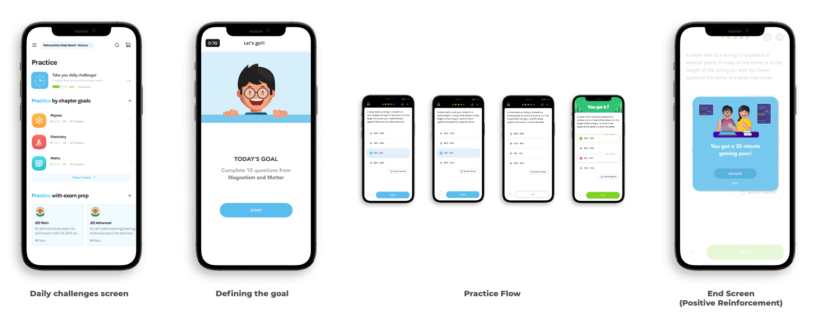
The Gamification Flow
Designing the nudges was the step-1 in making the practice tool better, daily challenges was one more proposed addition.
School OS
Designing a timetable for Students
and Teachers that use it daily.
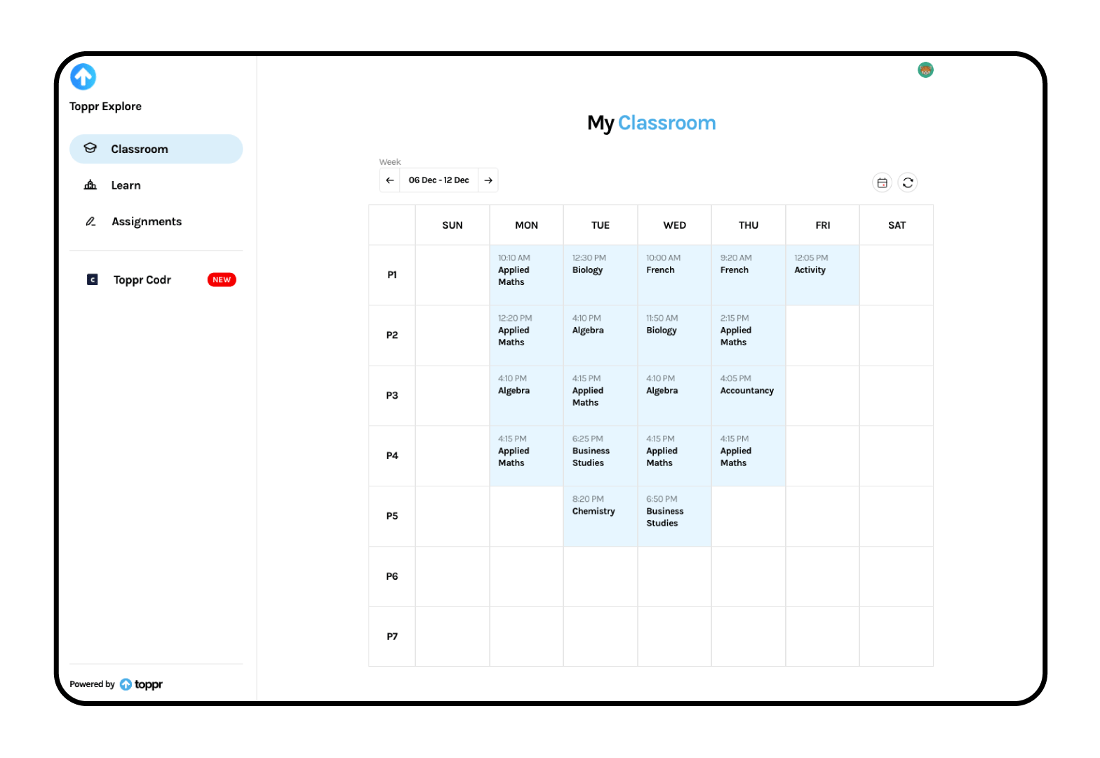
Current Design
Current design for the timetable was a bootstraped version and lacked the key design elements and principles.
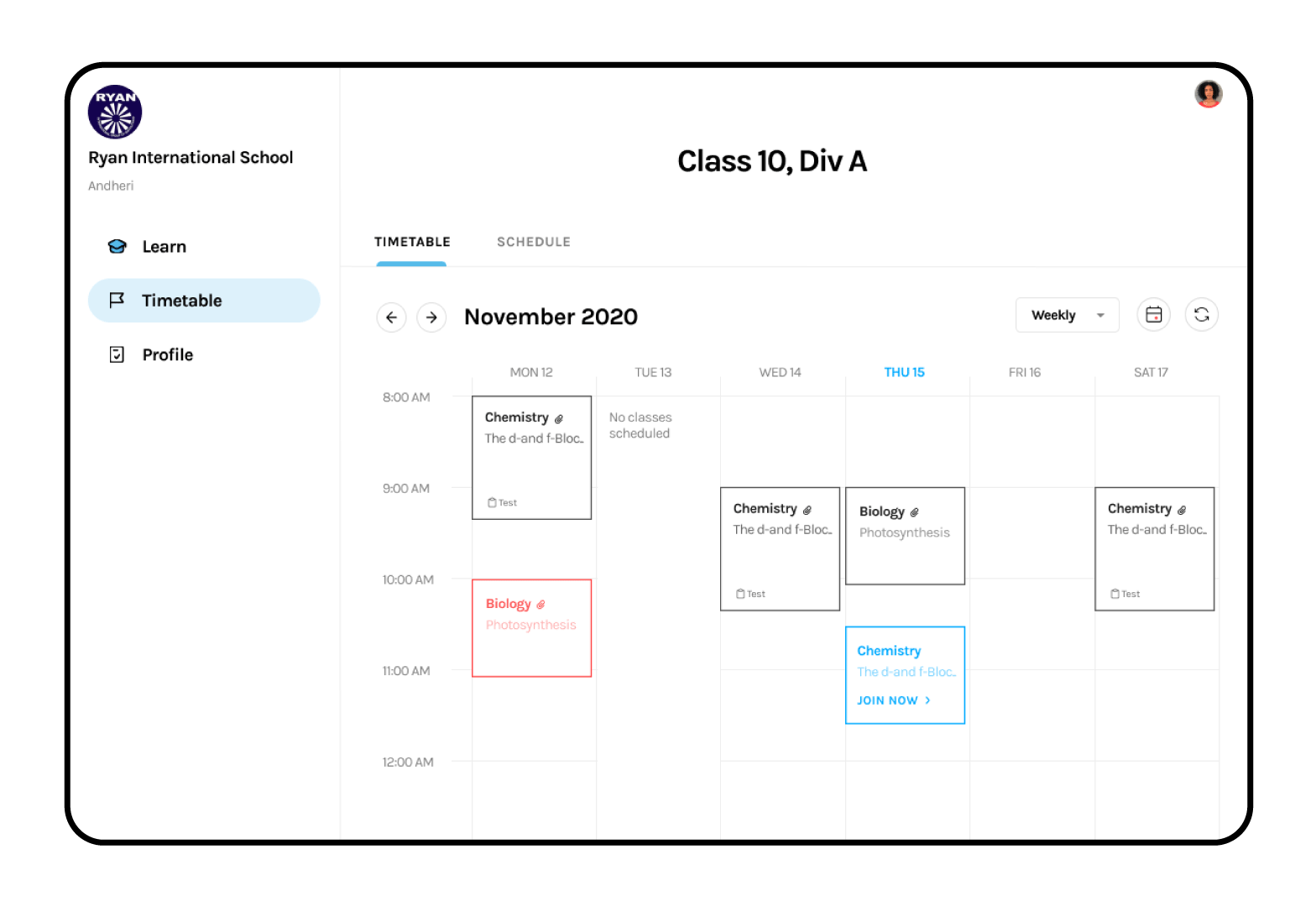
Explorations
Explorations included, playing aroud with the layout, individual tile design and colors.


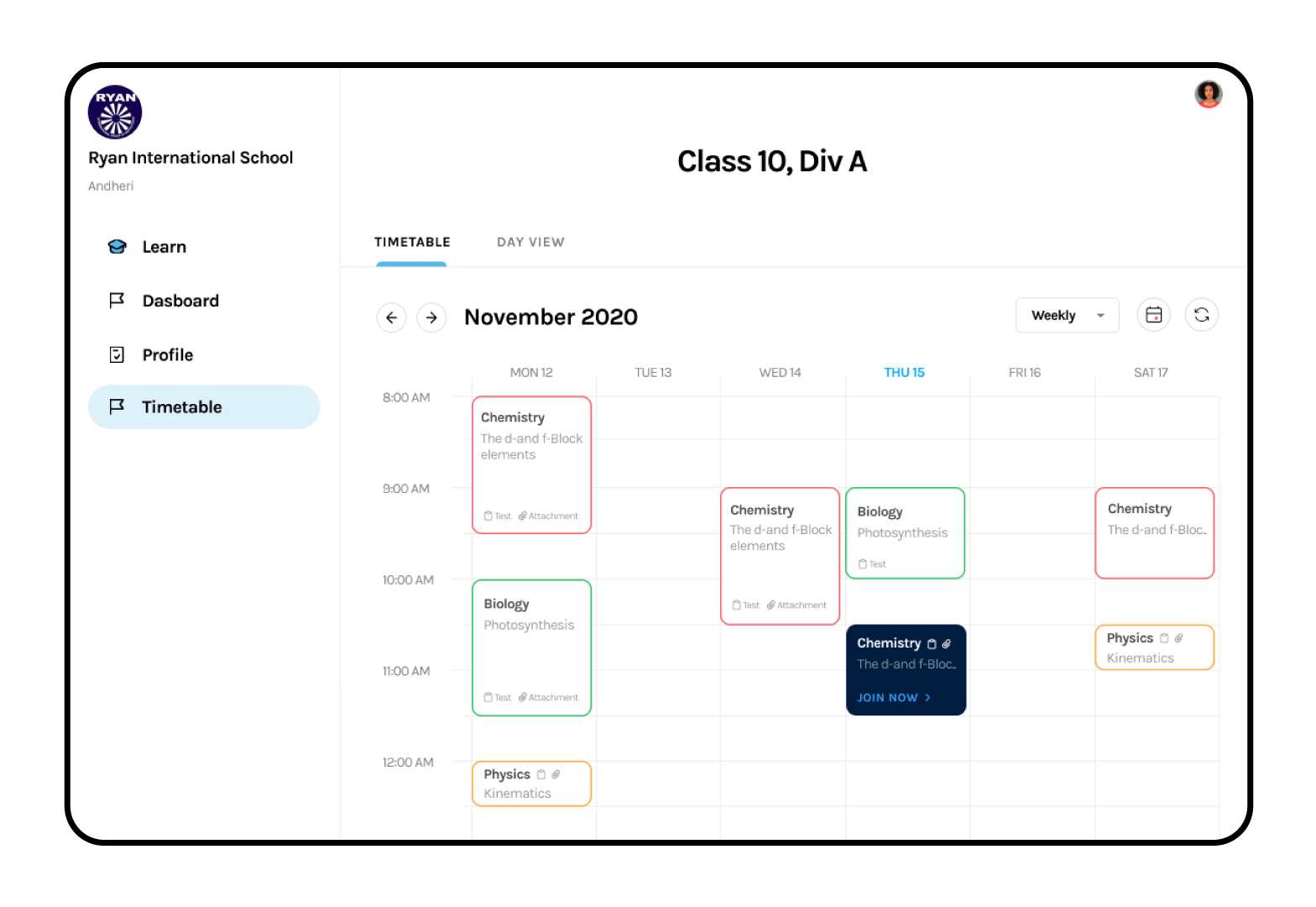
Weekly View
The final mockup for timetable had a weekly view and a more focused daily view.
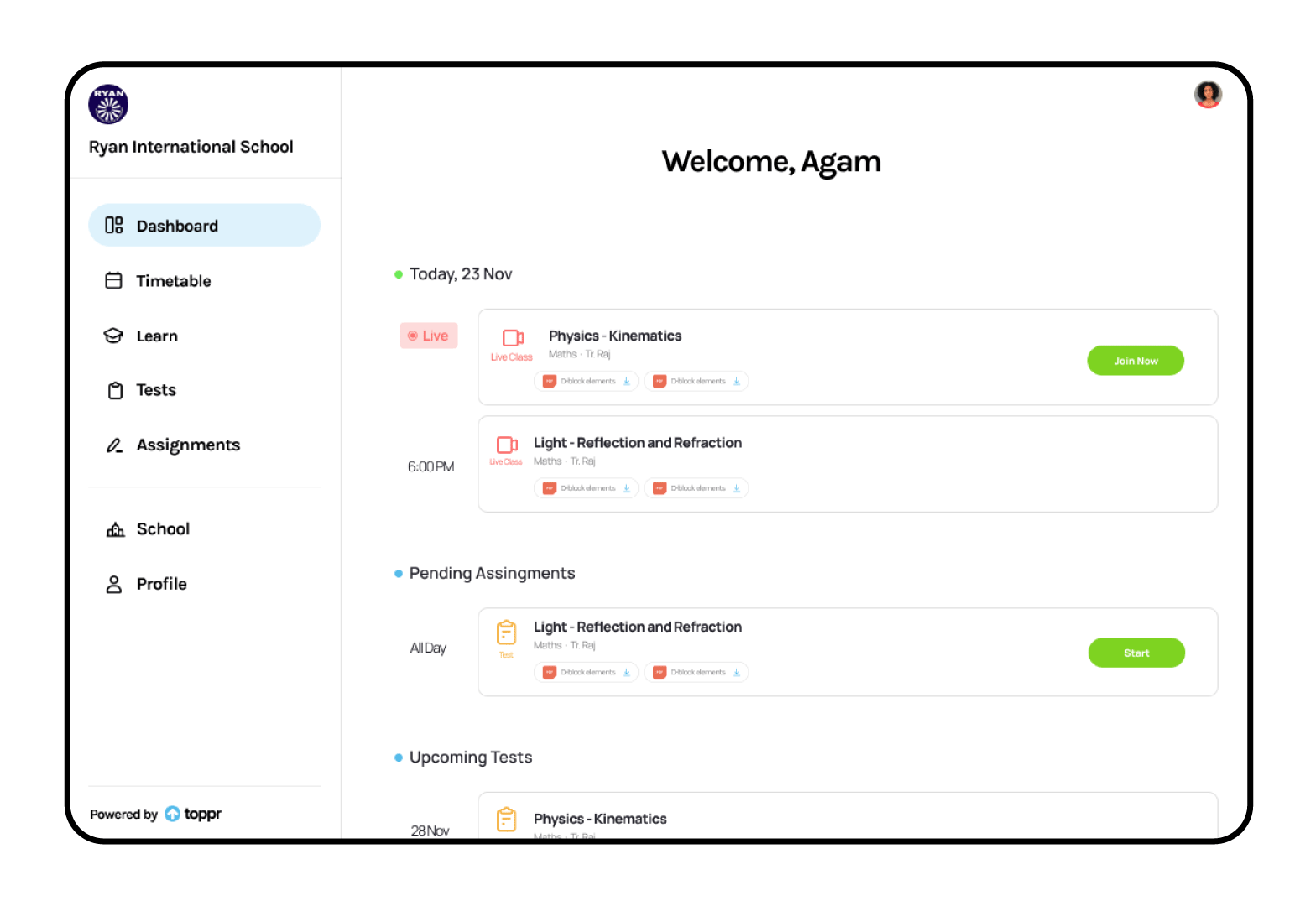
Daily View
The daily view was introduced to give students an overview of the things they should accomplish.
Competitive Analysis
Competitive Analysis for Toppr
"The competitive analysis included the major players in the edutech domain- Byju, Unacademy, etc. The objective was to analyse the login flows and understand what works."
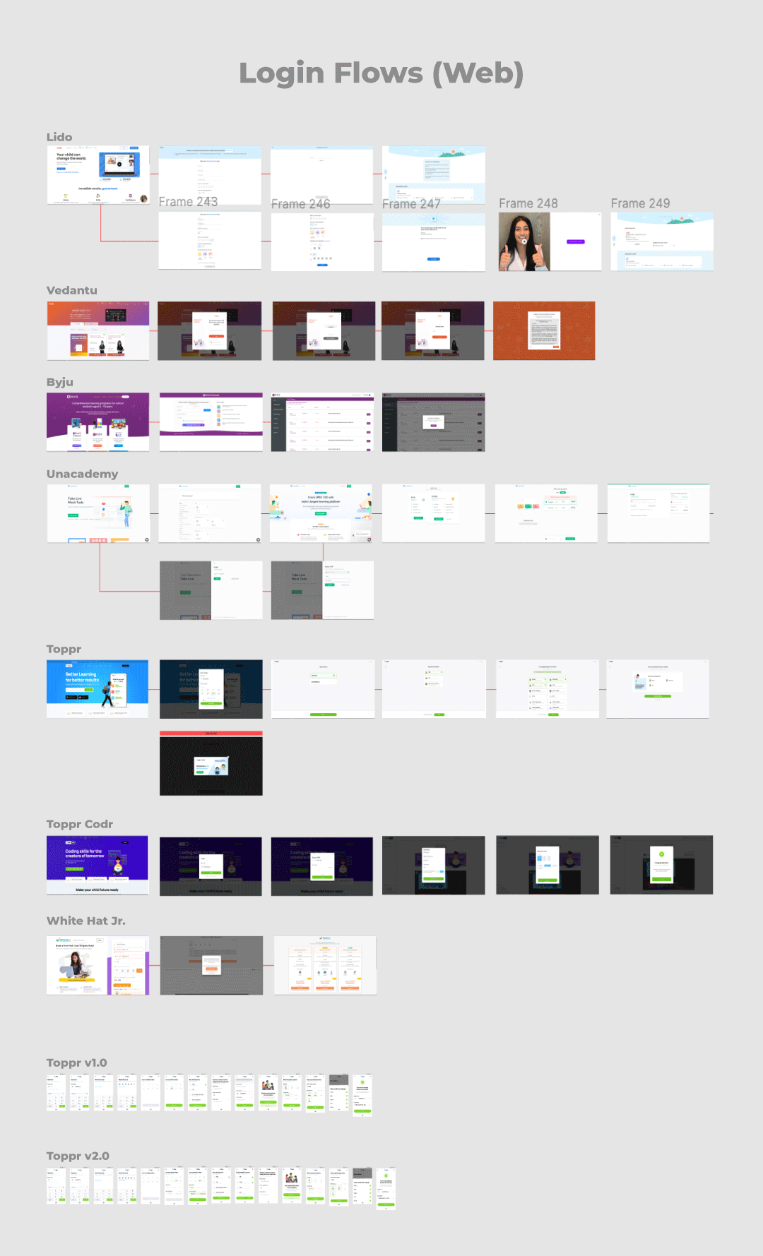
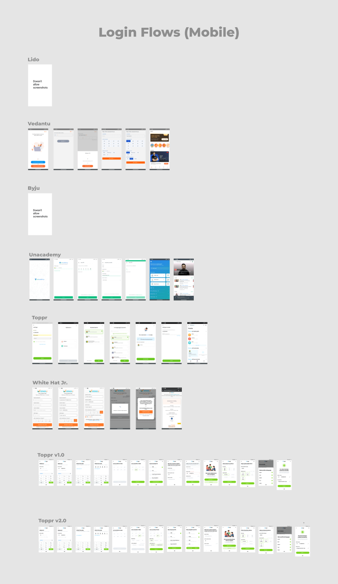
Coversation History & Analysis
As part of the competitor analysis, we wanted to map out how are competitors communicate and understanding the key-point that differenciates a successful conversion from a failed one.
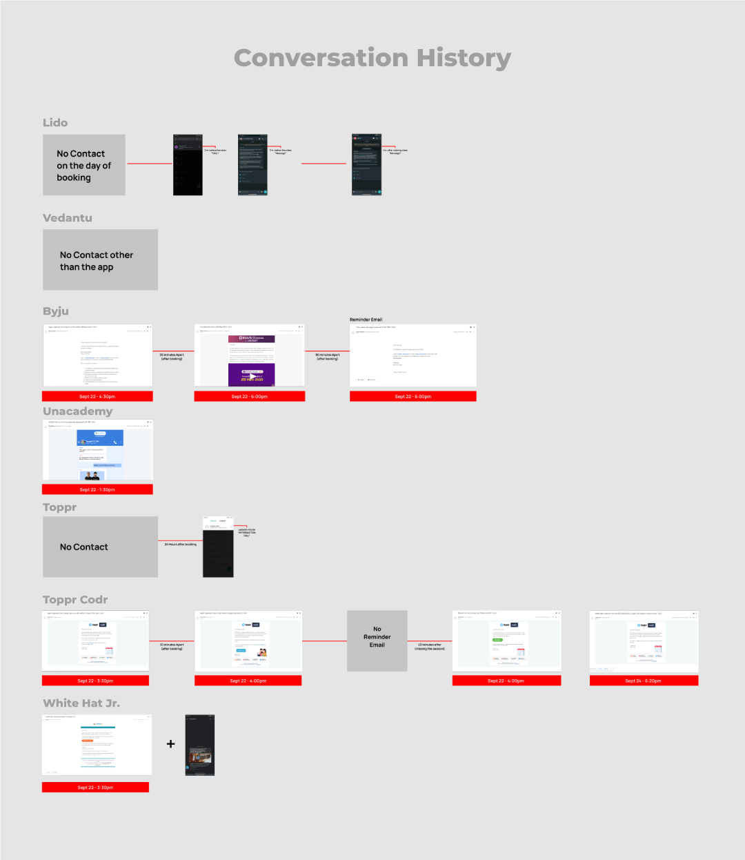
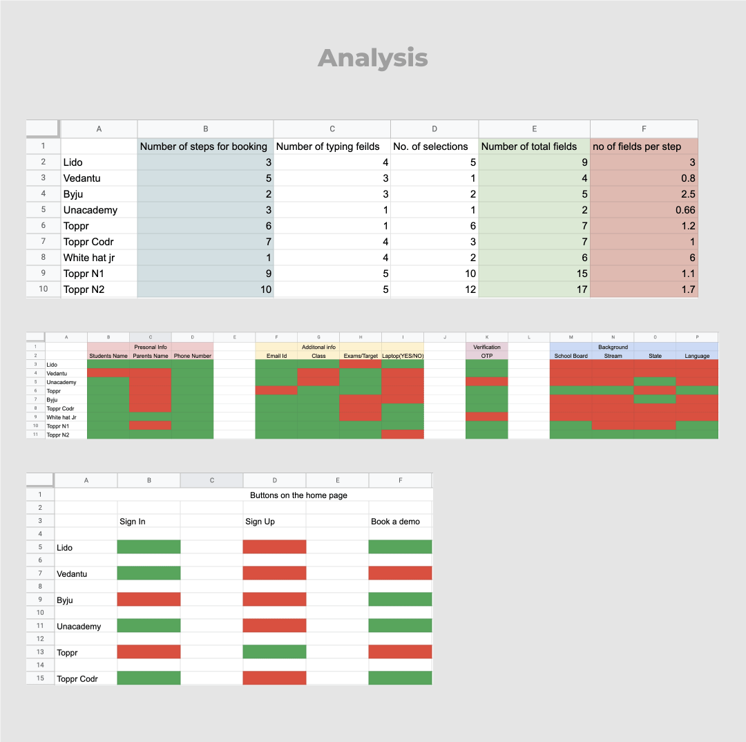
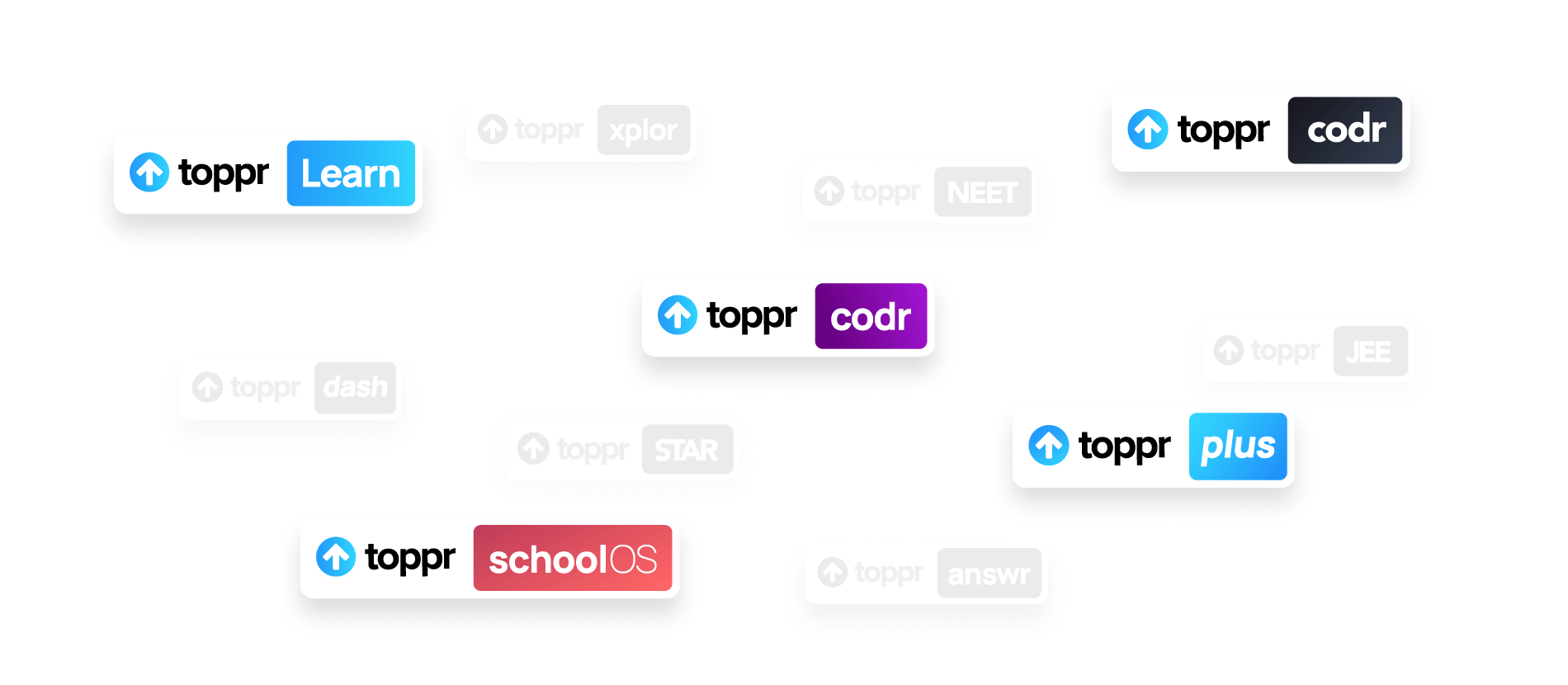
Logo Family
Toppr has various product in its
arsenal, I worked towards designing
a consistent logo family.
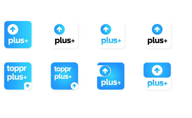
The Brief
To make a scalable family of logos that fit within the toppr ecosystem, There are some logos that already exists.
Explorations-Logo Style
This was the initial exploration targeted towards consolidating on a fixed style for the entire family.

Explorations-Logo Family
This exploration foced on the recognisability of the family as a set and as individual logos.

The Logo Family
The final logo family are based on the toppr plus logo, and used for the individual apps that are in the pipeline right now.

Toppr Ambassador
I lead design for the newly introduced
Toppr Ambassador Program.
The Brief
Ambassador re-launch required thinking from scratch both for the full-fledged product and MVP for initial launch.

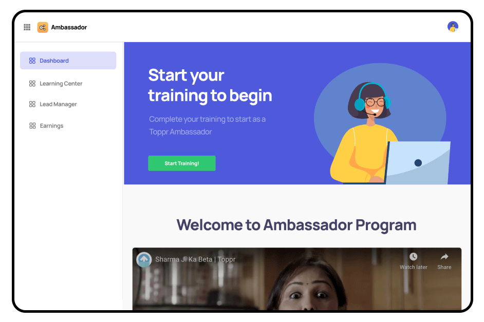
Homepage
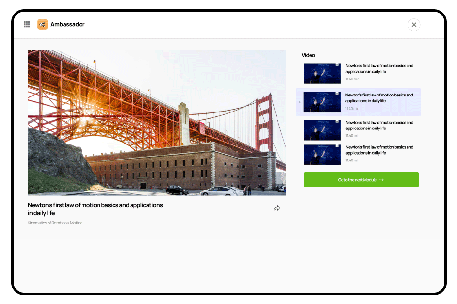
Learning Center

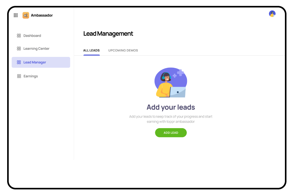
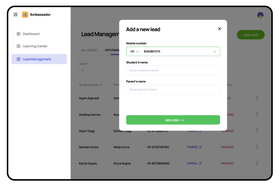
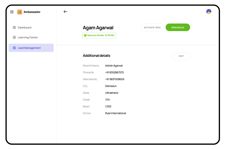
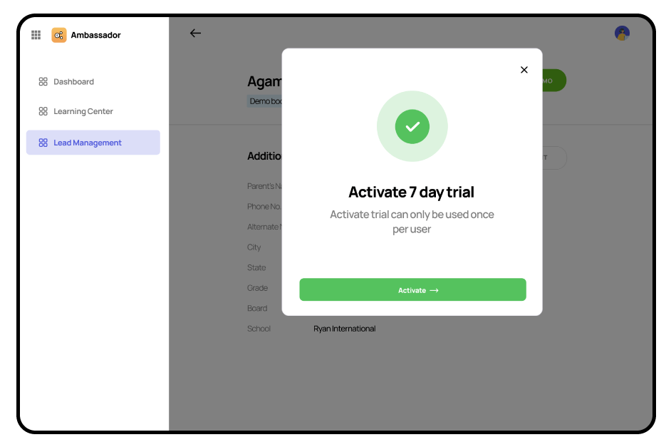
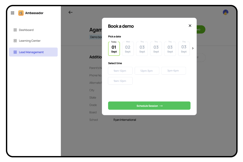
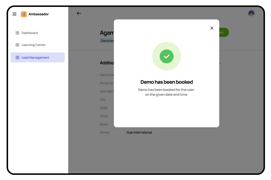
Lead Manager

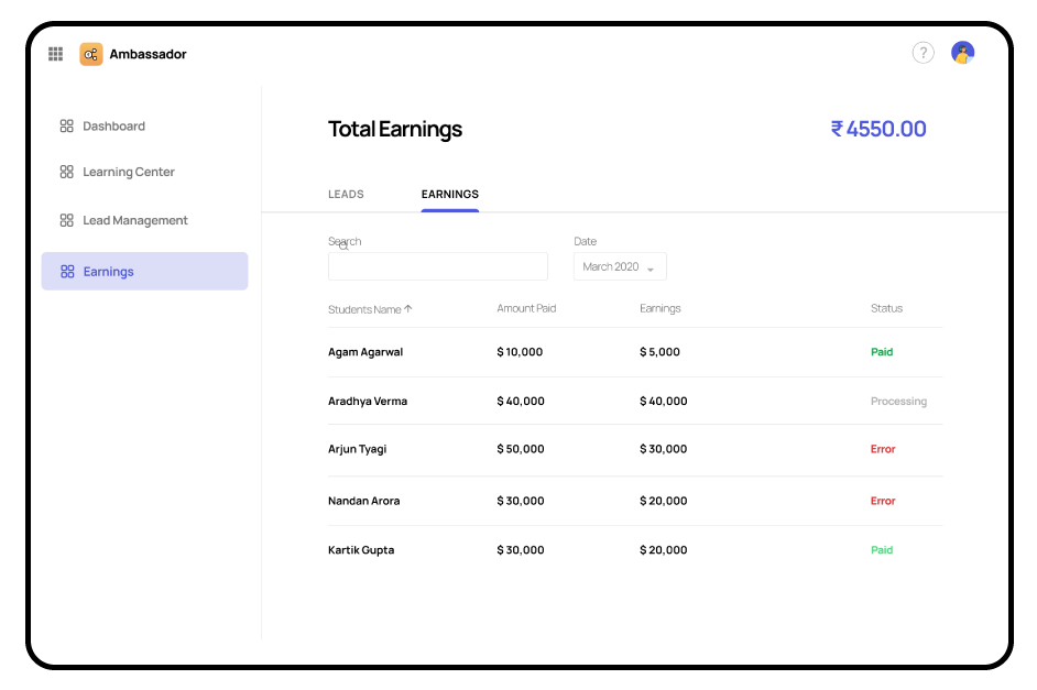
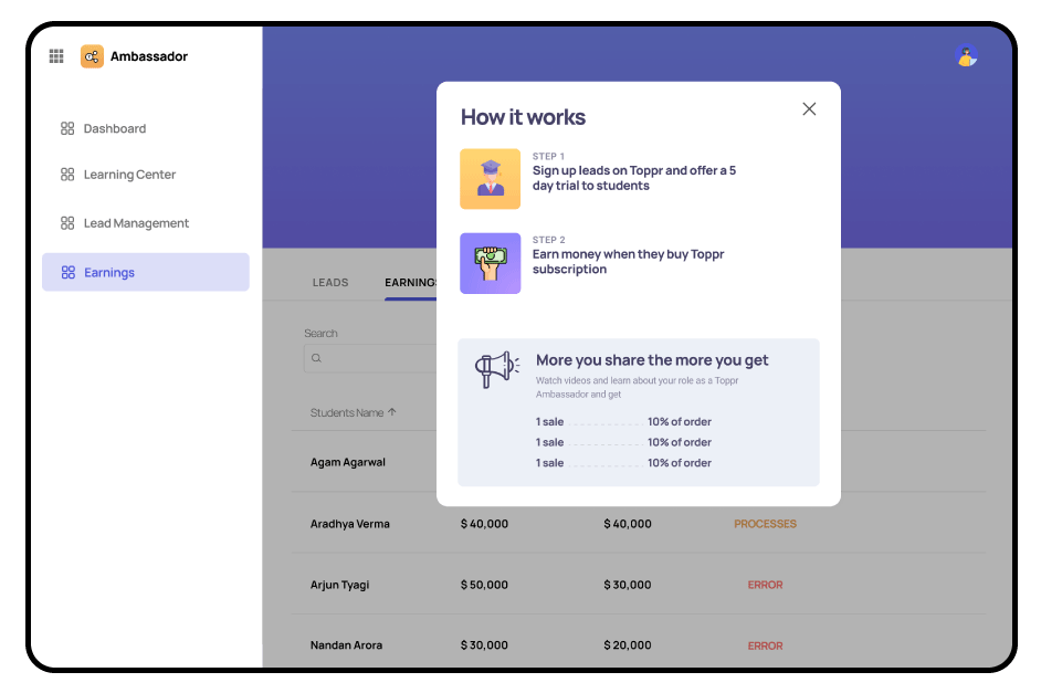
Earnings
Zero States
